Update dependency daisyui to v4 - autoclosed
This MR contains the following updates:
| Package | Change | Age | Adoption | Passing | Confidence |
|---|---|---|---|---|---|
| daisyui (source) | ^3.6.4 -> ^4.0.7 |
 |
|
|
|
Release Notes
saadeghi/daisyui (daisyui)
v4.0.7
v4.0.6
Bug Fixes
v4.0.5
Bug Fixes
v4.0.4
Bug Fixes
v4.0.3
Bug Fixes
- specificity issue on form inputs
v4.0.2
Bug Fixes
v4.0.1
v4.0.0
Breaking changes
-
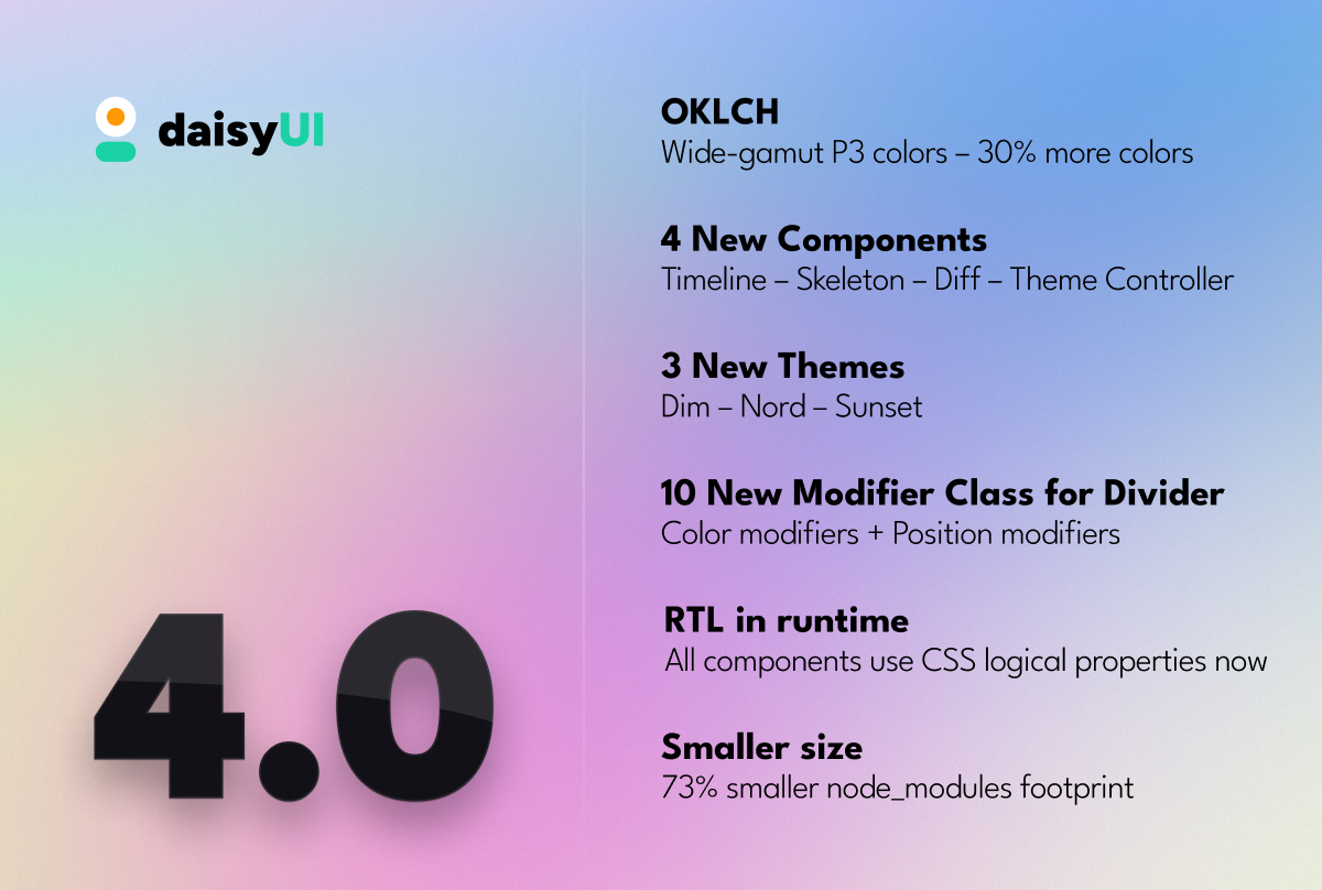
🌈 OKLCH colors- daisyUI 4 uses wide-gamut OKLCH colors internally instead of HSL now.
- The new OKLCH color model unlock access to 30% more colors comparing to RGB/HSL.
- All internal color variables (
--p,--s, etc) now contain OKLCH values instead of HSL. - If you're using those CSS variables directly inside your project like
hsl(var(--p))you have to change it tooklch(var(--p)) - OKLCH colors are supported in Chrome/Edge 111+, Safari 15.4+, Firefox 113+
- For old browsers, daisyUI provides HEX fallback colors only for the default dark/light themes.
- Read more about OKLCH colors here.
-
🌈 Color names- Removed all
*-focuscolor names. They where being used only for buttons. - Darker colors are now generated using CSS color-mix() under the hood.
- The following class names are removed now:
primary-focussecondary-focusaccent-focusneutral-focus
- You can also make a color darker or lighter using CSS
color-mix(). For example to make primary (--p) color darker by 7%, you can use this class name:
bg-[color-mix(in_oklab,oklch(var(--p)),black_7%)]
- Removed all
-
🎨 Themes- there's a change in property names in
daisyui/src/theming/themes.jsfile.
If you're customizing a built-in daisyUI theme like this: ...require("daisyui/src/theming/themes")["[data-theme=light]"], change it to: ...require("daisyui/src/theming/themes")["light"], - All theme colors adjusted for better contrast, better color harmony and better accessibility.
- there's a change in property names in
- 🧠 Logical CSS properties
- daisyUI 4 components use logical CSS properties instead of directional rules (
mr-*,pl-*, etc) - If you are using directional CSS rules (right/left) to modify daisyUI styles, it still works fine in LTR mode but you may want to double check.
- daisyUI 4 components use logical CSS properties instead of directional rules (
-
⬅ ️ RTL- Removed
rtldaisyUI config - All components now support LTR/RTL without any config or plugin.
- You don't need
tailwindcss-flipplugin anymore. - You don't need to set
rtl: trueintailwind.config.js - Just add
dir=rtlto<html>tag and everything will be RTL on runtime.
- Removed
-
🗂 ️ Tab- No need to repeat modifier classes for each
tabitem. - these modifier classes for
tabare removed:tab-liftedtab-borderedtab-lgtab-mdtab-smtab-xs
- Use the following modifier classes for the parent
tabsclass instead:tabs-liftedtabs-borderedtabs-lgtabs-mdtabs-smtabs-xs
-
tabsclass is now using grid, instead of flex. - Lifted tab now uses a single pseudo element (
:before) instead of two (:beforeandafter)
- No need to repeat modifier classes for each
-
⏺ ️ Button- buttons are not uppercase by default anymore
- Removed
--btn-text-caseCSS variable from themes
-
⚙ ️ Config- Removed
rtlconfig because RTL is now automatic
- Removed
-
📦 Dependencies- Removed
colord,rtlcss,postcss,tailwindcss - Added
culori,picocolors
- Removed
Features
-
💡 Efficiency- 92% less NPM module dependencies
- 73% smaller install size and node_modules footprint
-
✨ New components:timelineskeletondifftheme-controller
-
➗ New divider color modifier class namesdivider-primarydivider-secondarydivider-accentdivider-neutraldivider-successdivider-warningdivider-infodivider-error
-
➗ New divider position modifier class namesdivider-startdivider-end
-
🎨 New themes:- Dim
- Nord
- Sunset
-
⏺ ️ Buttons- Added hover color for the following other buttons:
btn-infobtn-successbtn-warningbtn-error
- Added hover color for the following other buttons:
-
🗂 ️ Tab- Empty
tabtag now grows and fills the empty space -
tabclass can now be a radio input.aria-labelvalue will be shown as the tab title so it's accessible for screen readers and keyboard navigation. - New
tab-contentclass allows you to switch tab content
- Empty
- 🧩
@tailwindcss/forms- Fix compatibility with
@tailwindcss/formsplugin (even though you don't need it alongside daisyUI)
- Fix compatibility with
-
⚙ ️ Config- New
themeRootconfig- Now you can define target another element instead of
:rootto receive the color CSS variables. - This is useful for using colors in shadow root.
- Now you can define target another element instead of
- New
Bug Fixes
- Text color for disabled input #1622
- Fix tab radius
- Fix missing utility classes
- Docs: Prefix not work on responsive classes #2445
- Hover animations for state buttons #1790
- Skeleton component #186
- Uppercase buttons #2187
Docs
- New translations for docs
- Arabic
- Farsi
- daisyUI official store – Get professional templates made by daisyUI
- daisyUI resources – A handpicked collection of community videos, articles and courses about daisyUI
- Add roadmap page
- Add docs for utiltiy classes
- Update theme generator
- Show browser support for components that are using new CSS rules
v3.9.4
Bug Fixes
v3.9.3
Bug Fixes
v3.9.2
Features
- improve logs (379137c)
v3.9.1
v3.9.0
Features
- increase Tailwind CSS dependency from ^3 to ^3.1 (35e577f)
v3.8.3
Bug Fixes
v3.8.2
v3.8.1
Features
- add
:focus-withinstyle to.input(#2363) (cac7938) - disable input outline when there's an
<input>tag inside a.inputwrapper (dc1766b)
Bug Fixes
v3.8.0
Features
v3.7.7
v3.7.6
Bug Fixes
v3.7.5
v3.7.4
v3.7.3
Bug Fixes
v3.7.2
Bug Fixes
v3.7.1
v3.7.0
Features
v3.6.6
v3.6.5
Bug Fixes
Configuration
-
If you want to rebase/retry this MR, check this box
This MR has been generated by Renovate Bot.
Edited by renovate